
Website layout and design is the foundation for any website and may be the single most important factor for success.
In this post, I will teach you about some basic website layout and design principles and attempt to break it down into an easy to follow formula that you can use on your own designs.
We will look at the different elements that make up a website and discuss each individual section.
Table of Contents
- KISS: Keep It Simple and Straightforward
- Website Structure
- Header Design
- Body & Content
- Content Layout Examples
- Footer Layout Examples
- Putting It All Together
KISS: Keep It Simple and Straightforward
Simplify to amplify. Less is more. However you want to say it, try to keep this simple principal in mind for all designs, especially when first starting out.
Website Layout and Design Basic Structure
I like to think of a website as having three main parts, which include the header, body, and footer.
Header: The top part of the website and can include elements such as the logo, navigation, search, tagline, and social media links.
Body: The bulk of the content sits in the body, including all the main copy, images, etc.
Footer: The footer is the bottom section of the website and typically includes copyright, additional links, contact info, and social media.
Once you study and learn the different layout variations, you should be able to design some effective website layout and design variations of your own.
Let’s take a look at an example of a typical website layout and design.
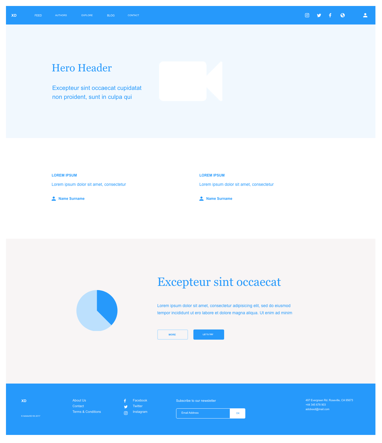
As you can see in the example above, the website layout includes all the key elements including the header with navigation on top, the body containing copy content with images, and the footer at the bottom of the page.
Let’s take a closer look at the key elements in our design.
Header Design
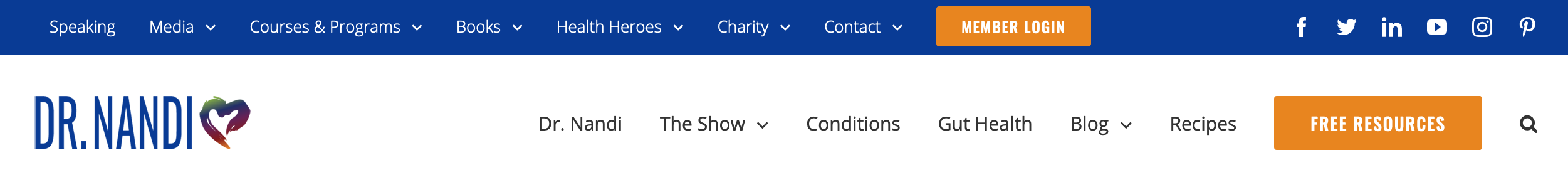
The header includes logo, navigation/menu, social media links, tagline, etc. Take a look at the examples below to see the different variations of headers.
Here are examples of five different header layouts I created for my clients and ideas that can help you design just about any website.
Standard Header with logo on left and navigation menu on the right
This is a very common header and is a great starting point for almost any website. It especially works well with sites that do not have a lot of pages while keeping the design nice and clean.

Standard header with logo on left and navigation on the bottom
This type of header is suitable for sites that require more top-level navigation items but do not require a secondary menu on top. You may also want to use this option for websites that include a tagline next to the logo or require additional info such as an email subscription form and search button.

Minimal header with hamburger menu
This header is nice and clean but requires the user to click on the menu icon to see the menu items as you would on most mobile websites.

Header with the main navigation and secondary top bar and links
This header can be useful for sites that have a lot of content or for websites that need additional information such as contact info, social media links, or a secondary menu at the top.
Centered header with transparent background on top of image or hero content
This header is a great option for image-focused websites and for logos and content that work well centered. If you choose this option, you will need to make sure all of the images for the rest of the website will work with the navigation color scheme. For example, white text will not work well with a light background and having a busy background may not look well with the navigation at all.

Looking at the header examples above, you can easily adapt these concepts to any website to see what works best for your company or client.
Your Turn
Now it’s time to try it for yourself. Try using the different design options above and create 5 different web design layouts.
Body & Content
The body section of a website contains the main content or “meat” of the website. This is what viewers come to see on a website.
The Grid System
When designing a website, it’s good to think in terms of columns and grids. Most websites these days are developed around a grid system.
The 960 grid system is a popular 12-column grid that has been widely adapted. Think of this as 12 equally divided columns running down vertically across your webpage. With this system, you can design and implement websites faster and more efficiently.
Columns
The new native WordPress Gutenberg Blocks includes columns much like the grid system. Now you can easily create different page layouts without having to download additional page builder plugins. This keeps code bloat to a minimum.
To test the breakpoints on a desktop, you can resize the screen by dragging the side or corner of the browser. As the screen gets smaller, the columns will start to stack on top of each other.
These columns make it possible for page builders to effectively and quickly build page layouts.
If this concept seems confusing to you, don’t worry. I didn’t really catch on until I started using it. Try not to overthink it.
Let’s take a look at some examples of how this works.
Content Layout Examples
Now lets take a look at some content layout examples using the same kind of grid column principles.
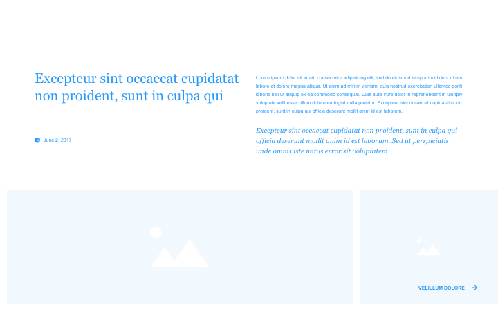
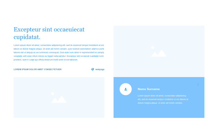
Looking at the examples above should give you a pretty good idea for what is possible with a grid system. Most modern themes already take advantage of this type of grid system and makes content layout much easier than having to hand code it.
Your Turn
Now it’s time to try it for yourself. Using the column and grid concept, try coming up with some layout ideas. Take a look at websites and see how they divide up content such as blog posts and different sections of content.
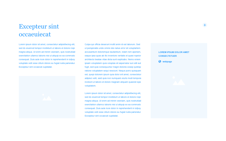
Footer Layout Examples
The footer is the bottom part of the website and similarly to the header, it will stay the same throughout the website. It can be as simple as a copyright date with site name and credits or it could contain a list of links to various parts of your website. Some common footer elements will include social media links, newsletter sign up, link to privacy and terms, and contact info.
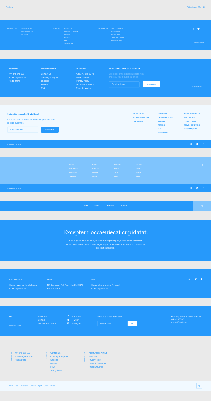
The examples above were taken from Adobe XD’s wireframe web kit and show the different elements and layout possibilities for a website footer.
Your Turn
Now it’s time to try it for yourself. Try designing some footer layouts using some of the examples above. The type of website may determine if you need footer links, social media, email sign up forms, or other content but its good practice to at least have copyright and date.
Putting It All Together
Now that we’ve looked at designing each of the three main sections of a website and the grid system concept, you should be able to play with a number of different layout combinations and come up with a variety of designs.
I hope this has been helpful to you. Please share your comments or ideas on how I can improve this post.
Thanks for these wonderful website layouts & designs ideas. They are so cool. I will try to implement some. Wish me luck.